Story Web Configuration Menu
This menu allows you to configure the visual appearance of various parts of your Story Webs. You can customize the colors and line styles used to represent different types of relationships between entries, as well as set what fields are displayed when hovering over an element.
See Story Web Connection Styles for more information on using connection colors/styles in Story Webs.
INFO
No changes are saved in this dialog until you hit "Save Changes". You can use the "Reset" button to revert any unsaved changes.
Connection Colors Tab
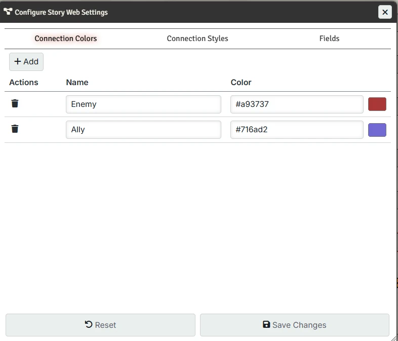
The Colors tab allows you to manage the color palette available for story web connections.
Managing Colors
- Add Color - Click the Add button to create a new color option
- Name - Edit the display name for the color (shown in menu when setting color and in a tooltip when hovering over the connection)
- Color - Click the color picker to choose a custom color
- Delete - Remove a color with the trash icon
Connection Styles Tab
The Styles tab allows you to configure the line styles available for story web connections.
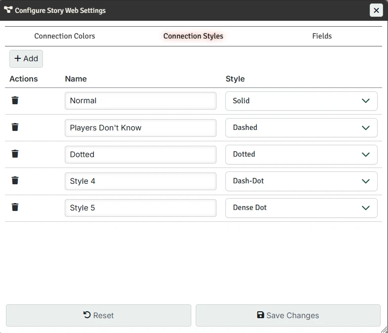
Managing Styles
Add Style - Click the Add button to create a new line style option
Name - Edit the display name for the line style (shown in tooltips and legends)
Style - Choose from available line styles:
- Solid - A continuous line
- Dashed - Broken line with regular gaps
- Dotted - Line made of dots
- Dash-Dot - Alternating dashes and dots
Delete - Remove a style with the trash icon
Fields Tab
The Fields tab allows you to configure the tooltips that appear when hovering over an entity in a Story Web. Each content type can have its own display settings.
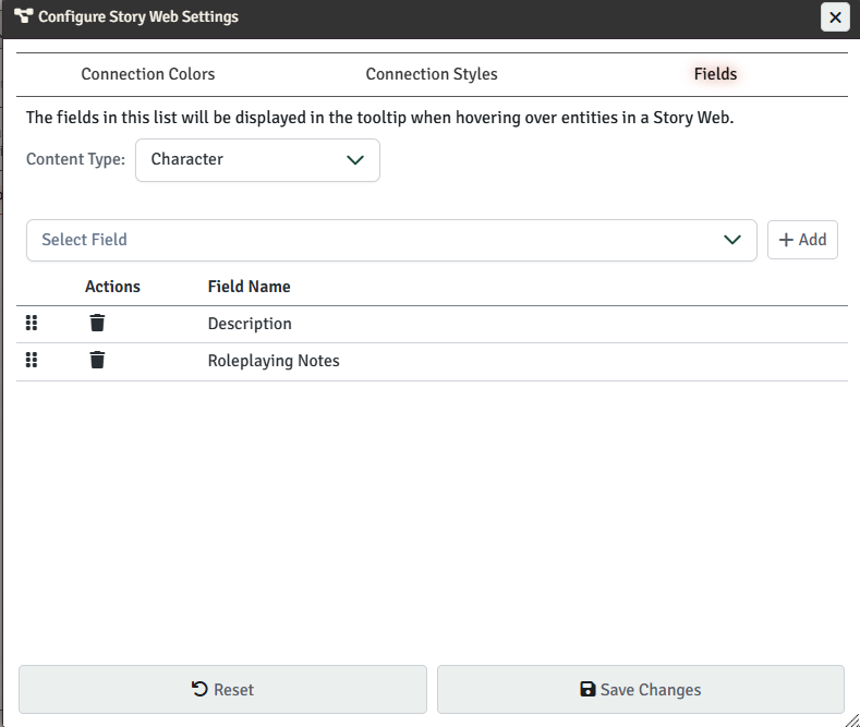
Managing Fields
To manage the fields that display, first choose the content type you want to configure, then choose the field you want to add to the list and press "Add".
You can then delete fields or reorder them by dragging and dropping them to a new position.